John Deere
B2B SaaS Webapp Enterprise Design
Problem & Objective

John Deere's MAI(Manufacturing, Analytics and Insights) is a SaaS Enterprise Web application to help various field managers across different manufacturing levels in their organisation to track relevant analytics, Key Performance Indicators and derive insights to make data-driven business decisions. John Deere sought to address the field managers' struggles with a platform providing more efficient and accurate insights.
Fig: Database tables in JD's Legacy System
Unpersonalized Data access
Field managers faced a challenge where their data access lacked personalization, limiting their ability to obtain information tailored to their roles and needs.
Legacy System Data
Information in their Legacy System was disorganized and spread across various tables and databases, making it difficult for field managers to retrieve relevant data efficiently.
Inaccurate Data Insights
The manual extraction and merging of data led to laborious processes, causing delays, non-real-time insights, and a heightened risk of inaccuracies for field managers.
Fig: Userflow and Pain-points
A flow that causes Inefficiency multiple times can be problematic for users for several reasons:
- Cognitive Overload: Lack of personalization can result in cognitive overload for users, as they have to sift through irrelevant information, leading to frustration and decreased efficiency.
- Navigation Challenges: Poor information architecture hampers findability, making it challenging for users to locate the data they need promptly.
- Delayed Insights: Non-real-time data access impedes the user's ability to make timely decisions, potentially leading to missed opportunities or inefficient operations.
Fig: Data access by employees in existing architecture
Post research and brainstorming sessions, I converged on 3 main features which would be beneficial for the users by addressing their pain points.
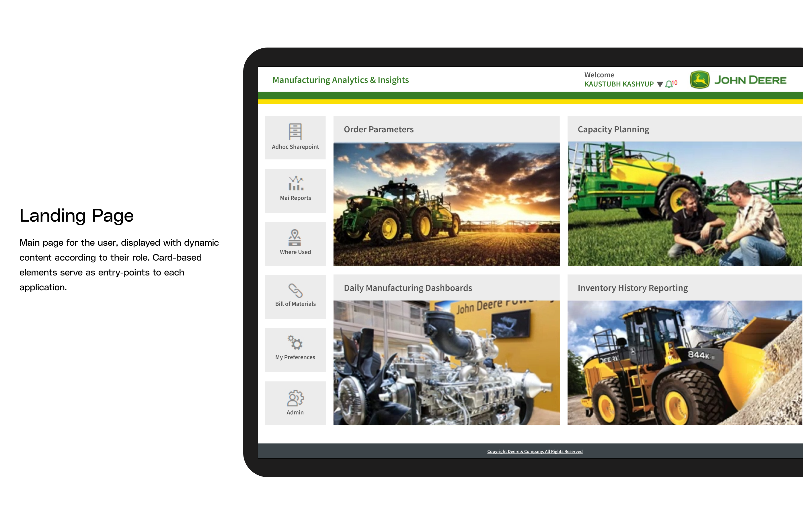
- Role-based Landing Page: Each field-level manager would have access to a personalized Landing Page, displaying relevant modules of John Deere's manufacturing process defined by a set of roles in the system. This would allow the employees to only deal with information pertinent to their level in the workforce.
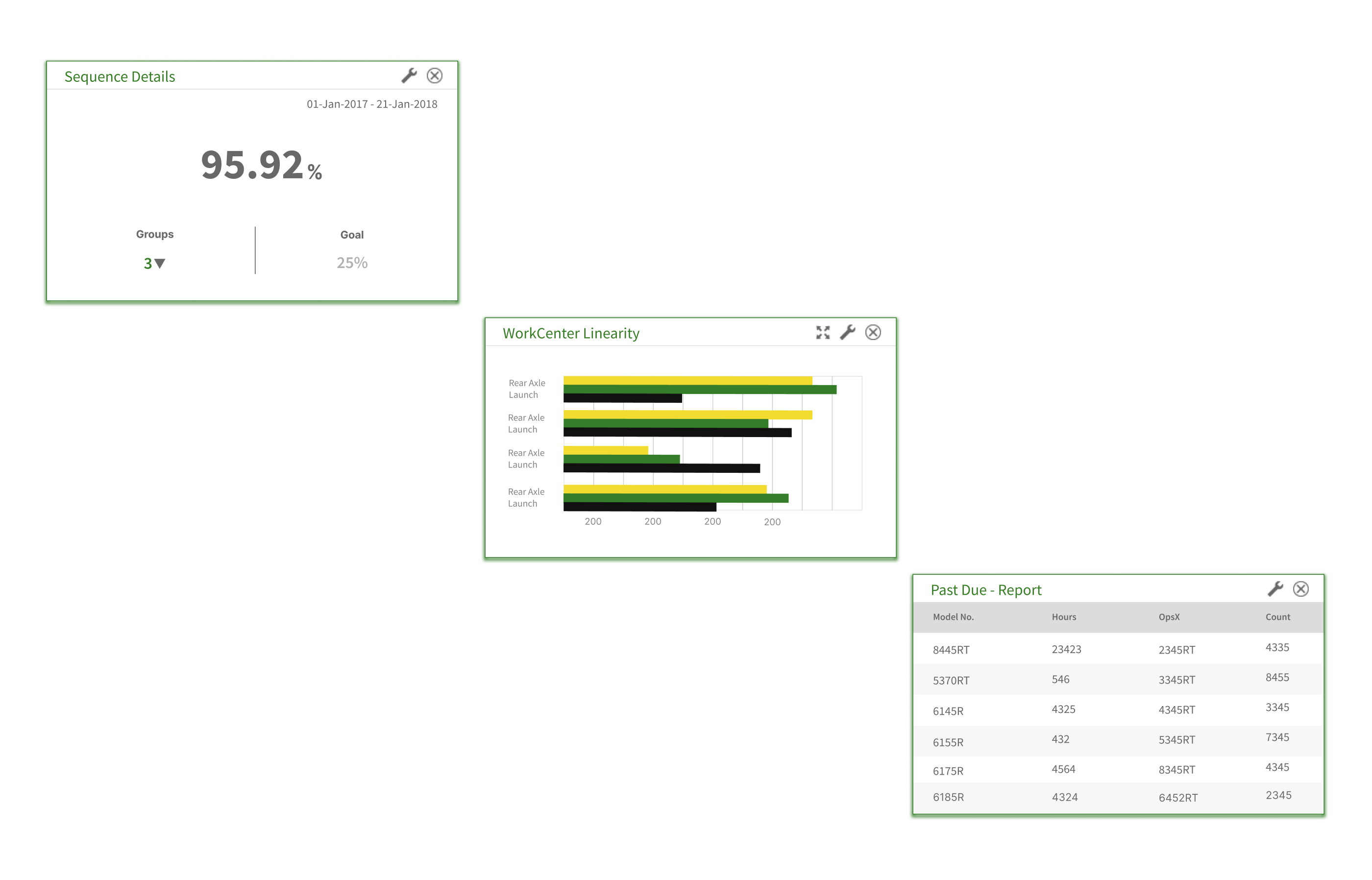
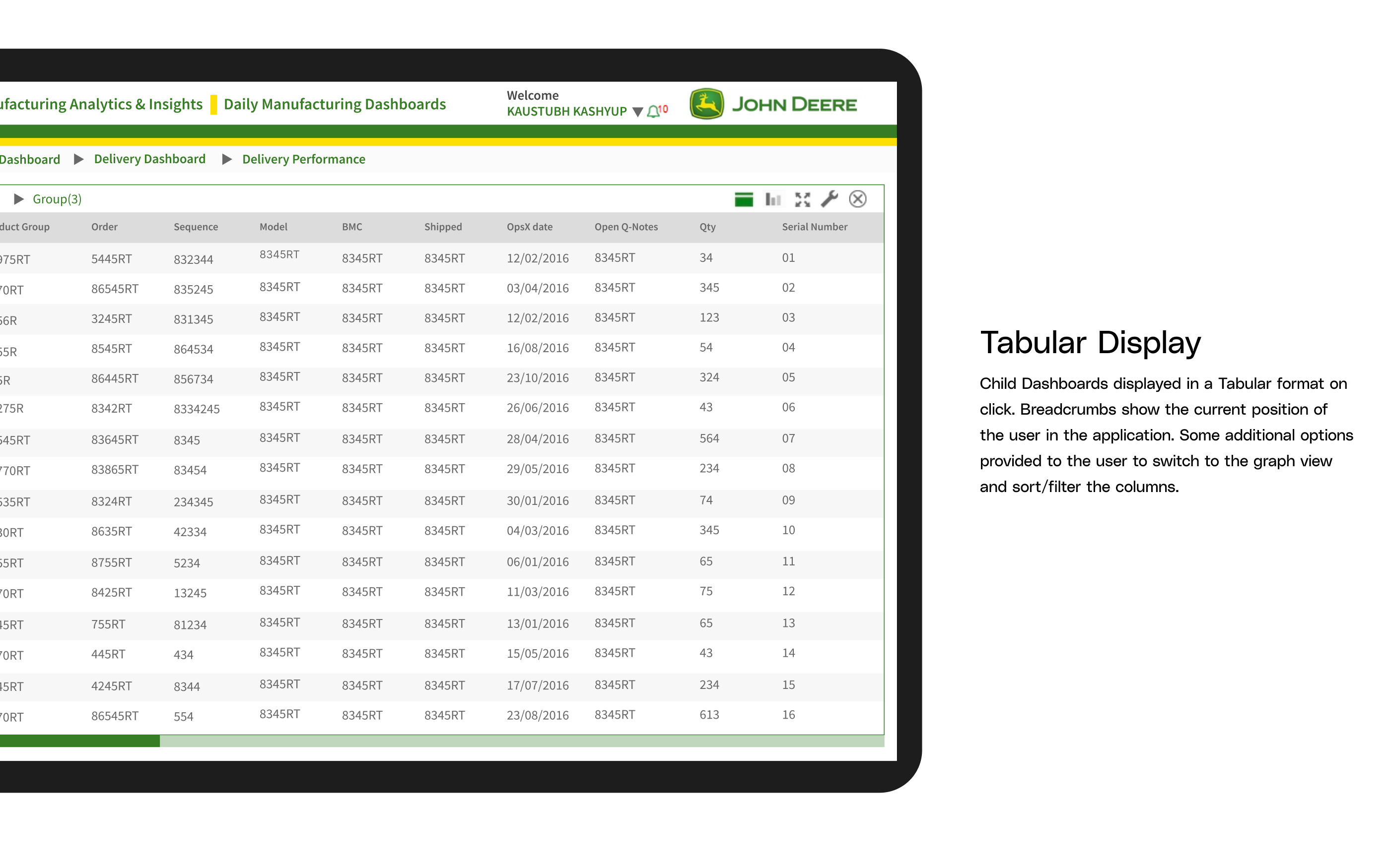
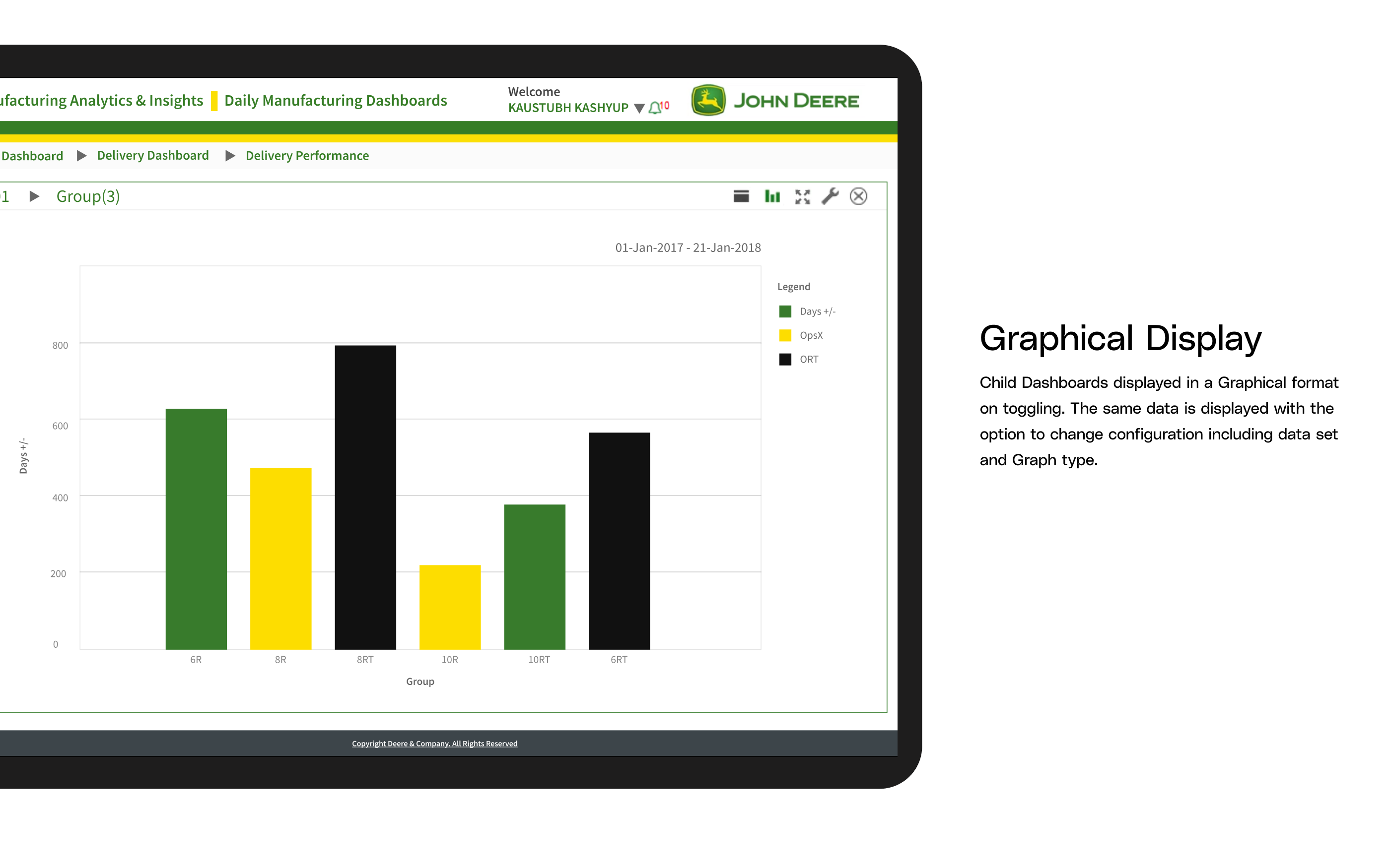
- Dashboards supporting Tabular and Graphical View: Within each module, field-level managers would be able to dissect data briefly or in detail with the help of tables and graphs. This gives the managers the control to use graphical representations of data to gain insights on KPIs and trends or derive specific information about particular manufactured products using tables.
- Real-time Data Representation: Personalized dashboards containing real-time data, each reloading separately with new information at regular time intervals, would solve the major problem of handling irrelevant data manually. This ensures that the user sees up-to-date information on each screen with automated data pulls.
In order to incorporate data personalization, I broke down the existing structure of database tables and introduced role-based access to design relevant dashboards for the users.
- Hierarchical Sitemap: An information architecture was meticulously crafted, reflecting the organizational process hierarchy: Plant - Group - Workcenter - Material. This hierarchy formed the foundation of the application's structure, ensuring that users could navigate the system intuitively based on their roles and responsibilities
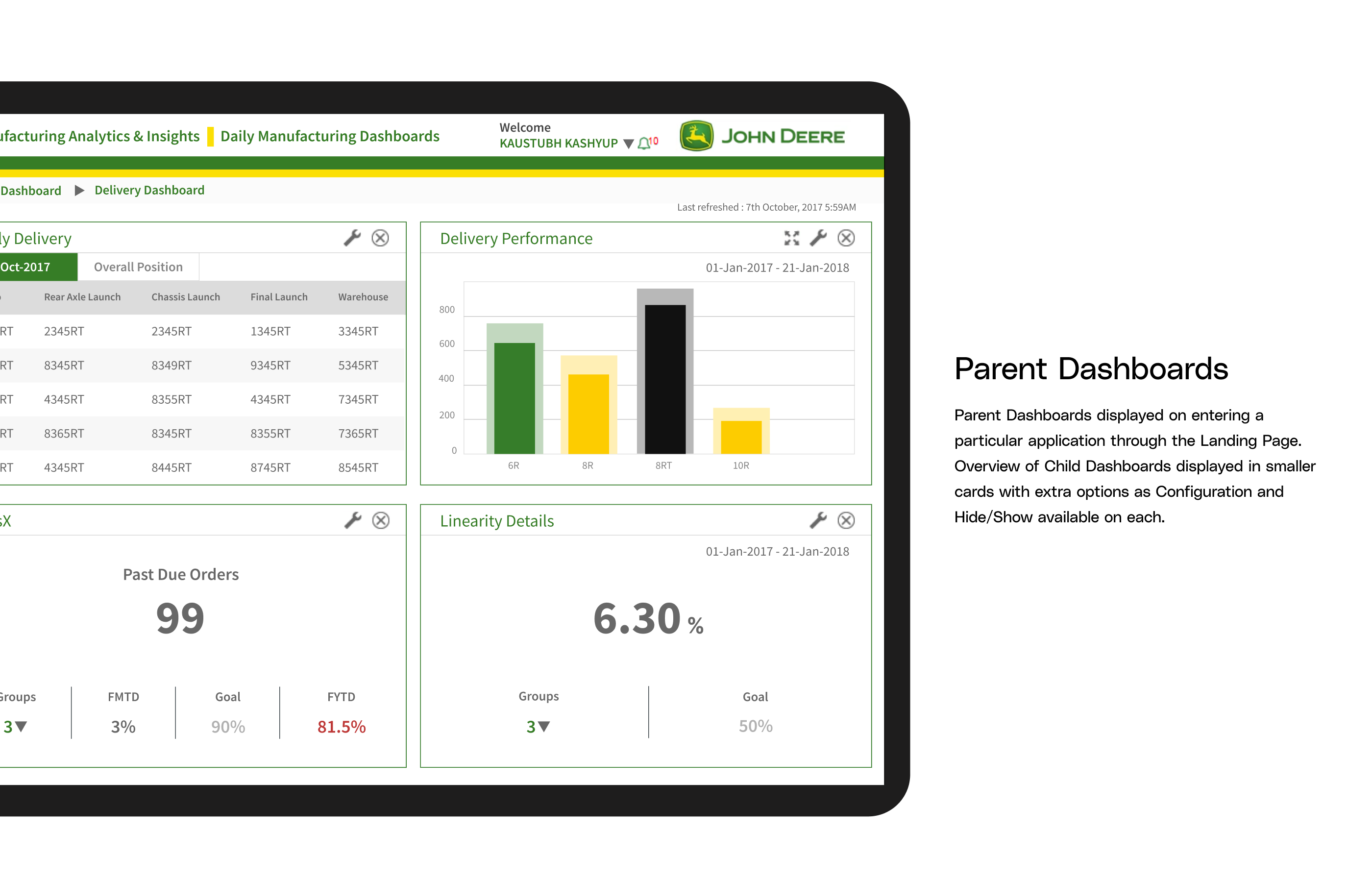
- Dashboard Relationships: Parent and child dashboards were identified, and their relationships were clearly defined. This ensured that users could easily access relevant data and insights with minimal effort.
Fig: Re-organized sitemap
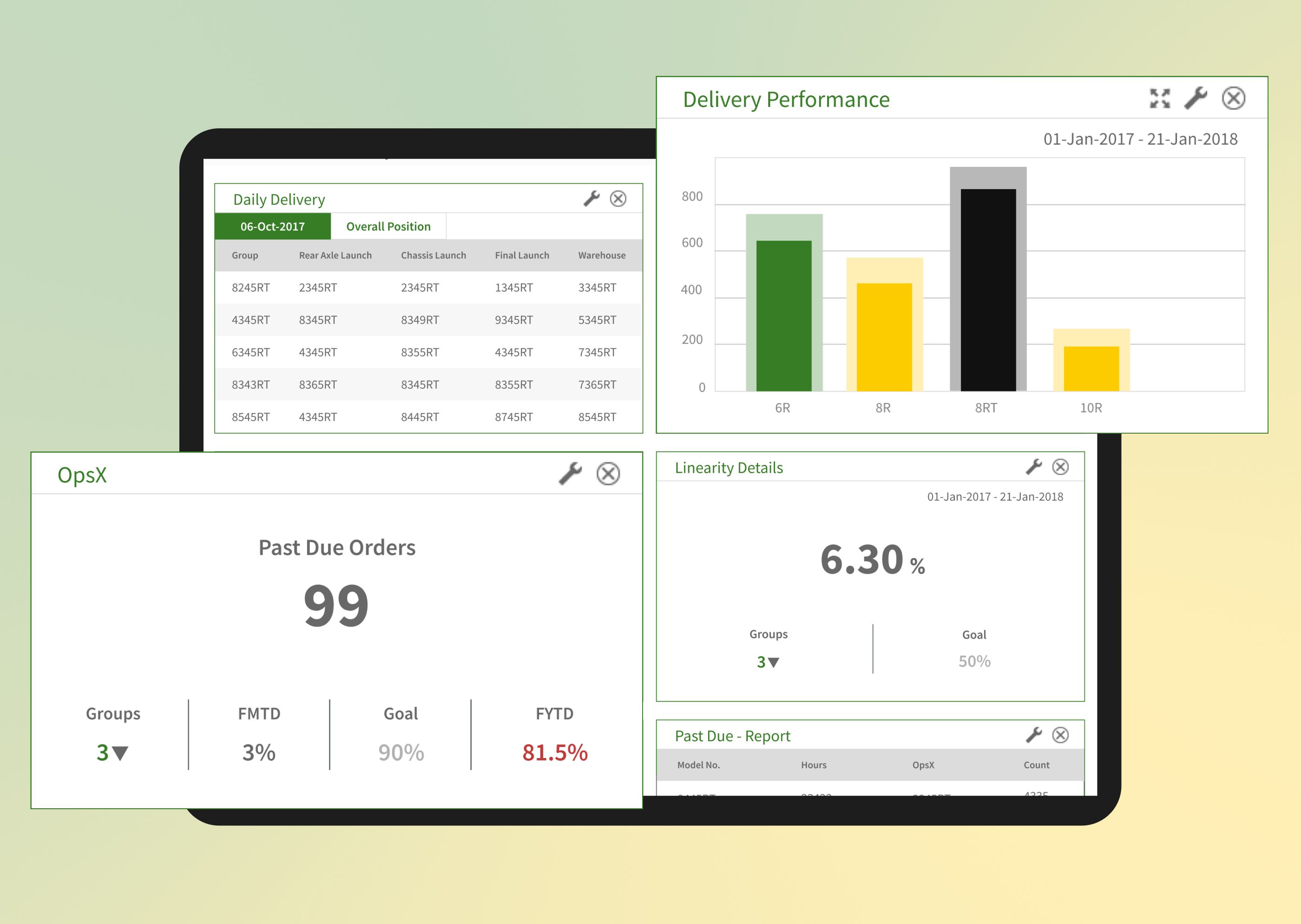
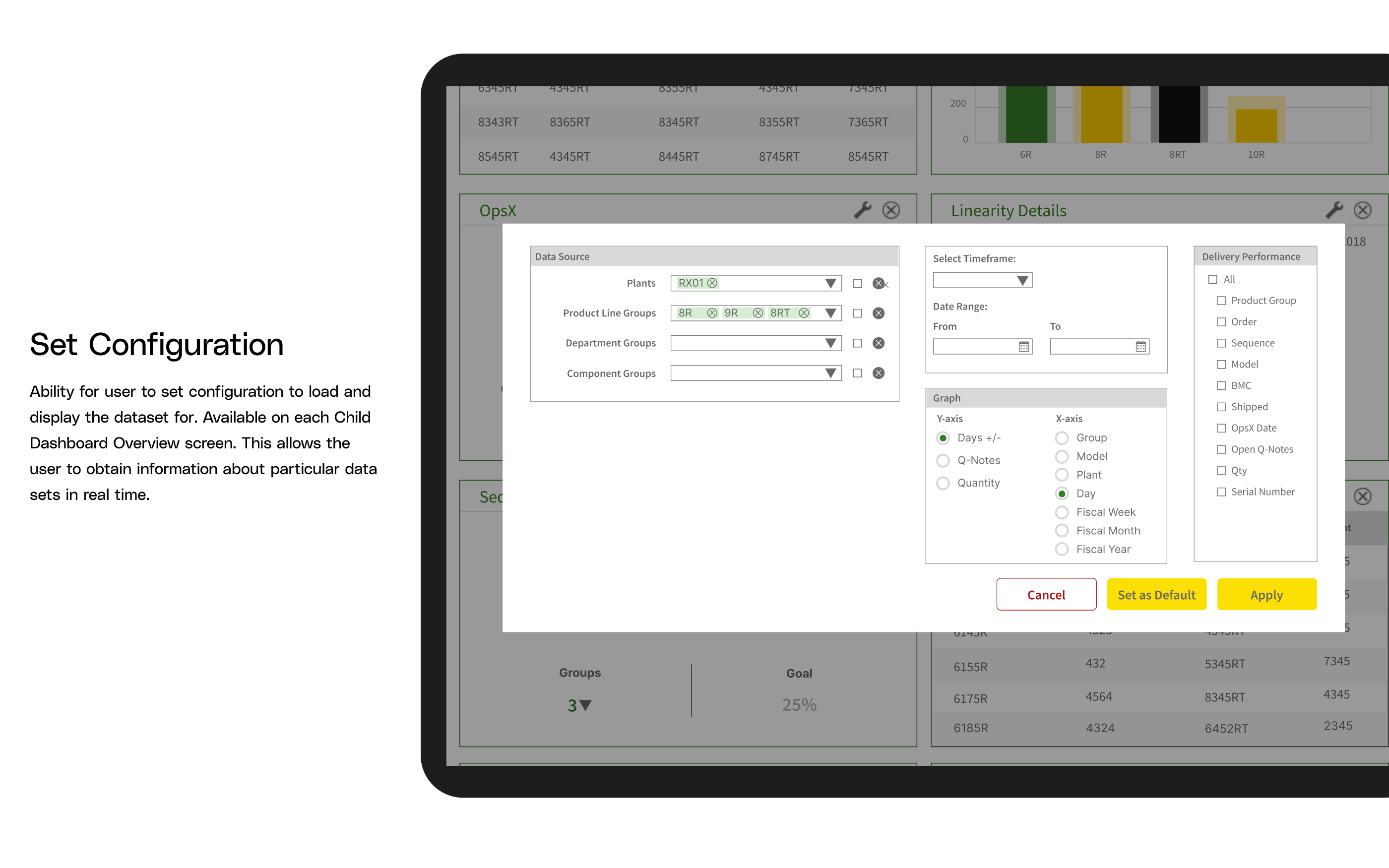
To visually streamline and refine the proposed solutions, high fidelity wireframes were designed.
I prioritised a clean Card based layout for the Landing page and the independent Parent Dashboards to keep distinct information organised into separate groups. Most of the parent dashboards have a consistent Configuration icon to allow personalisation of data. Users can also show/hide each parent dashboard based on their preference. Breadcrumbs acted as the main navigation component on delving deeper into the Child Dashboards containing Tables and Graphs.
Fig: Hi-fidelity Wireframes
Design System
A robust Design System was designed to focus on the UI branding of the application by making design decisions on Colour palettes, Typography, design elements and assets such as buttons, cards, form elements etc that would help communicate the brand’s identity and align with the applications use-case. Additionally, I also worked on developing a Component Library consisting of reusable components which were further used by the development team as well. All assets were created in Figma.
Fig: Design System
Qualitative feedback was gathered and analyzed. This feedback provided rich insights into user interactions, preferences, and areas for improvement. Users' comments and suggestions were documented and used to refine the design further. Testing questions were categorized such as -
- Role-Based Navigation: Are users able to intuitively navigate through the role-based landing page to access relevant modules based on their responsibilities?How does role-based navigation impact users' efficiency in accessing critical data?
- Data Analysis Tools: Is the combination of tabular and graphical data views an intuitive and helpful feature for analyzing complex manufacturing data?How do users perceive the effectiveness of data analysis tools in improving their decision-making capabilities?
- Real-Time Data: Do users perceive real-time data representation as valuable, and does it meet their expectations for timely insights?How do real-time updates impact users' ability to respond to changing conditions in the manufacturing process?
- Design System Acceptance: How do users respond to the design system elements, including color palettes, typography, and UI components, in terms of visual appeal and ease of use?Does the design system contribute to a cohesive and user-friendly interface?
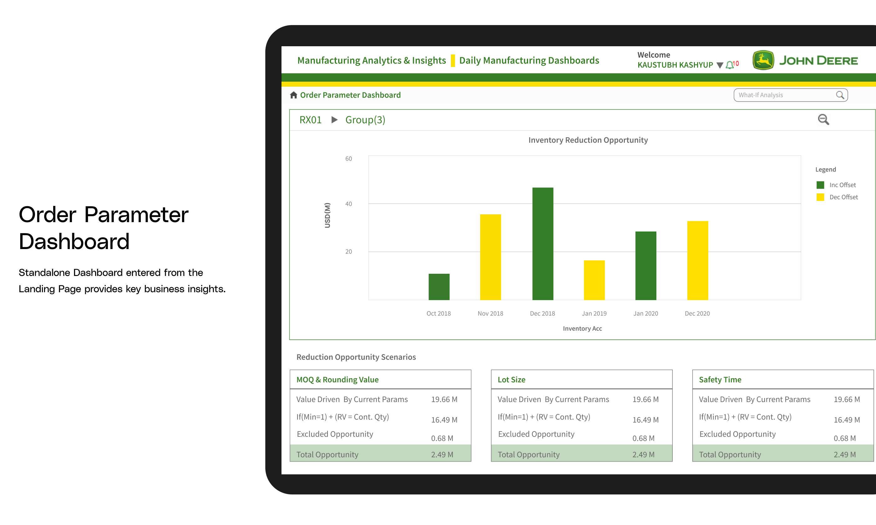
UI Mockups
These final UI mockup designs aligned seamlessly with the John Deere brand identity and catered to the specific use-case requirements. Screens included: Role-based landing pages, Parent dashboards, Configuration settings, and Data visualization options.
Fig: Final UI Solutions
Conclusion
User Satisfaction: User satisfaction showed a significant increase following installation, according to surveys. In contrast to their experiences with the previous system, respondents reported feeling more satisfied. The new system's Net Promoter Score (NPS) increased significantly, indicating a greater degree of user advocacy.
Data Accuracy: A thorough process of improving data quality led to a 25% decrease in mistakes connected to the data. This decrease greatly improved the system's ability to produce reliable insights, which resulted in more precise and knowledgeable decision-making.
Dashboard Generation Time: Reduced the average time to generate real-time dashboards by 50%, resulting in quicker access to critical analytics and KPIs for time-sensitive decision-making.
Decision Making: Improved data-driven decision-making by 45%, as managers were able to track relevant metrics more effectively, enabling them to identify trends and make informed business decisions.