
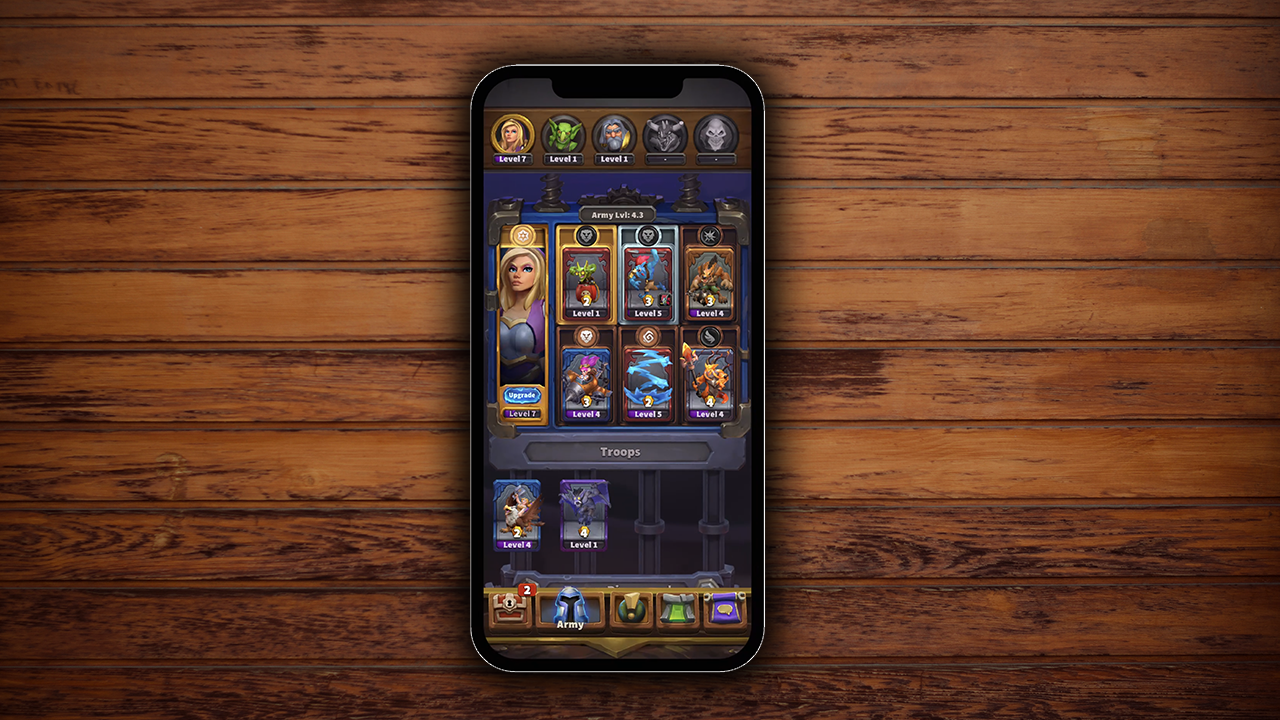

Warcraft Rumble is a mobile action strategy game by Blizzard Entertainment set within the Warcraft universe where collectible Minis come to life to battle in frantic melee skirmishes. Blizzard wanted to improve the Army Leader selection process to help the players manage their armies seamlessly. My responsibility was to improve the user experience of this process.
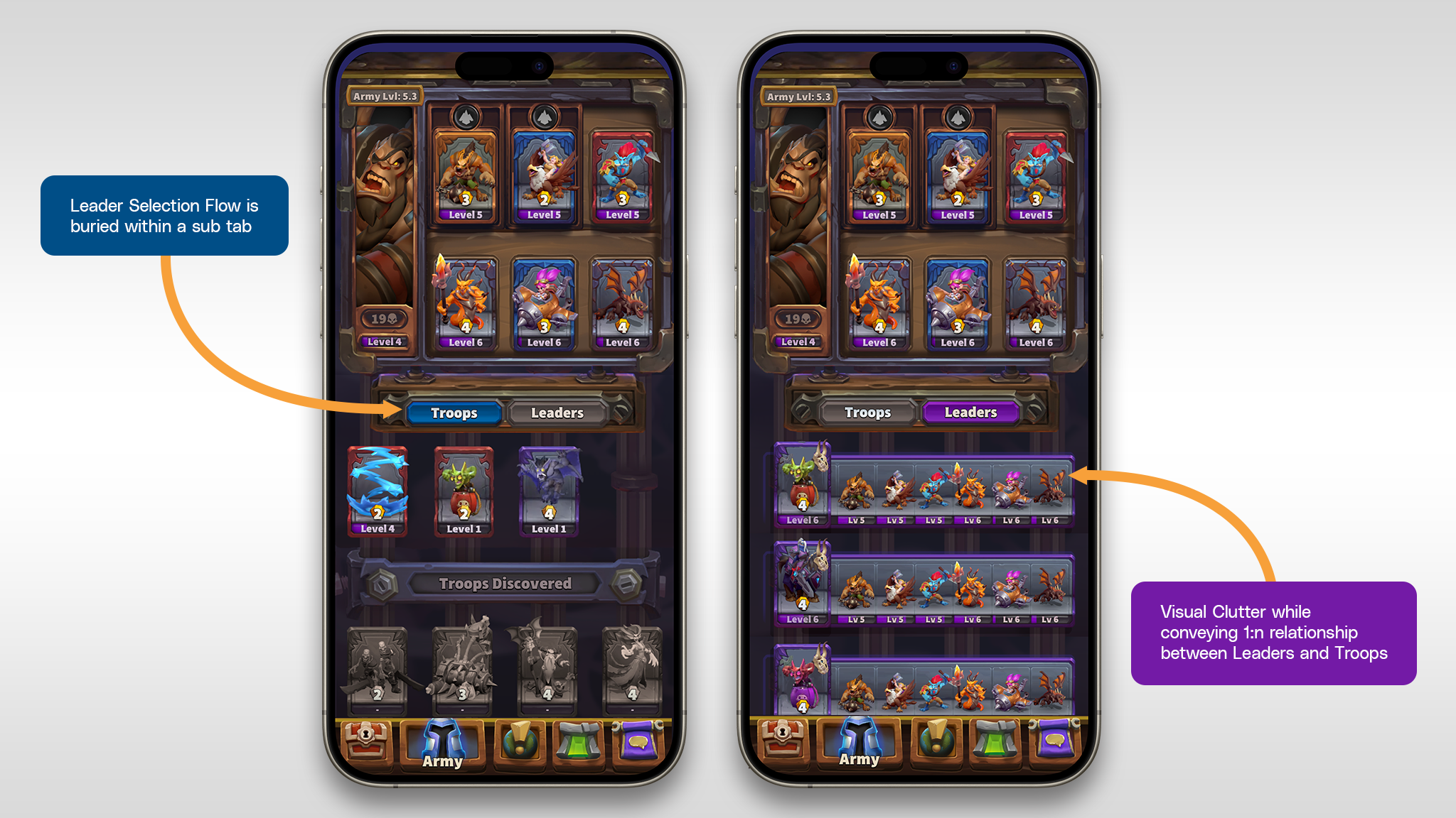
Fig: Problems in existing view
To Select a new Leader and access a different Army, the player has to navigate to the Leader Tab.
Each Leader controls 6 Troops which can be selected from all discovered Troops. The same troops can be assigned to different Leaders, i.e they are not unique.
The cosmetics will be unique to each Army and should be incorporated directly on the army screen instead of introducing an entirely new screen or burying this information within another sub navigation.
To Select a new Leader and access a different Army, the player has to navigate to the Leader Tab.
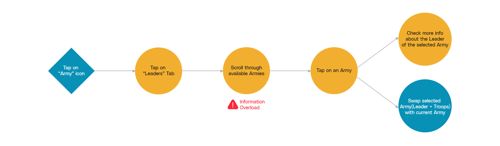
Fig: Userflow and Pain-point
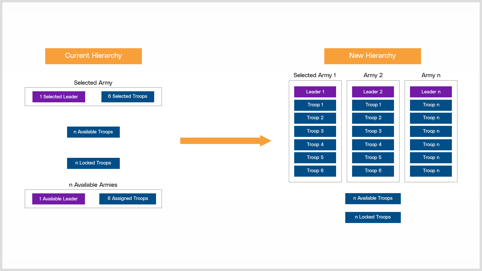
Fig: Hierarchy Improvements
Making Leaders visible on the screen at all times to establish it as an entry point to the players armies would establish the Leader-Troop Hierarchy. This could be achieved by always keeping the Leader Selection process visible on the screen. This change would also work positively for the planned future cosmetic changes which shared a 1:1 relationship with each Leaders as well.
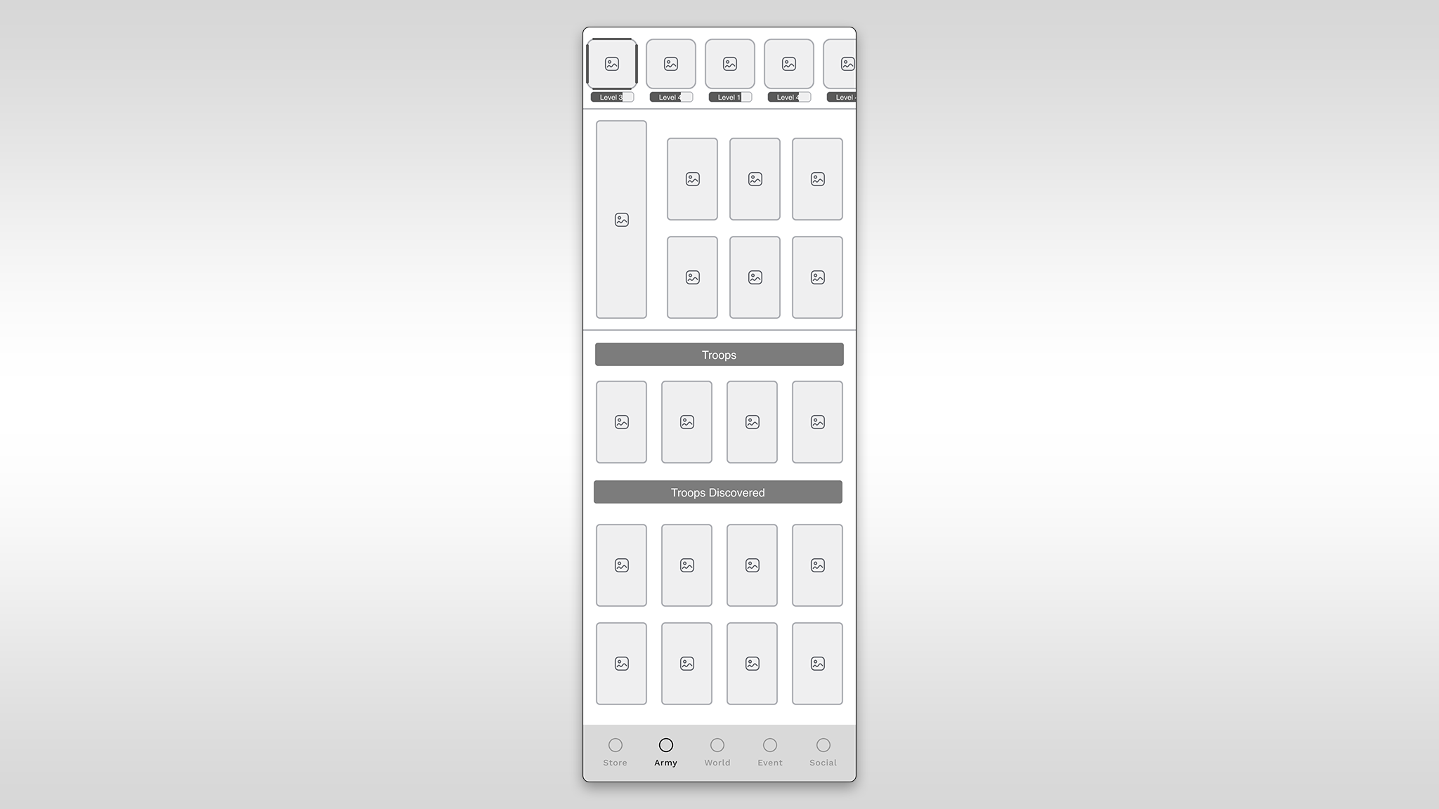
Fig: Option 1
Visual Hierarchy: Places Leaders in a prominent position, establishing a clear visual hierarchy and aiding quick identification.
Consistency with Conventions: Adheres to common design conventions, reducing the learning curve for users familiar with other games.
Intuitive Association: The top placement reinforces the association between Leaders and Troops, contributing to a more intuitive user experience.
Space Constraints: Limited space at the top may result in a cramped design, especially on smaller screens, potentially affecting usability.
Thumb Accessibility: Users may find it less ergonomic to reach the top of the screen, particularly on larger devices, impacting one-handed usability.
Potential for Clutter: If not designed carefully, the top placement could lead to visual clutter, especially when there are numerous Leaders.
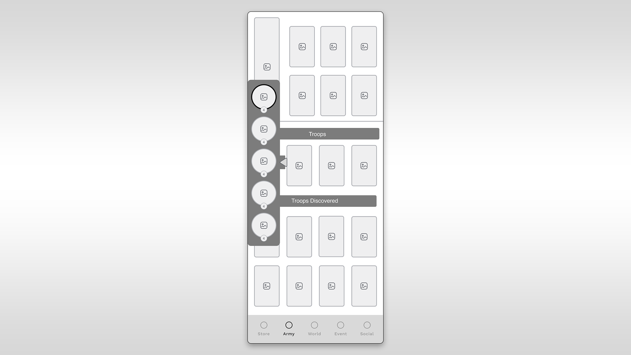
Fig: Option 2
Space Efficiency: Efficiently uses screen space, especially on wider screens, providing a clean and organized layout.
Expandability: The expandable panel offers flexibility, allowing users to focus on either Leaders or Troops, reducing visual overload.
Logical Flow: Aligns with left-to-right reading direction, contributing to a natural and logical flow for users.
Hidden Information: Users might overlook Leaders if the panel is collapsed, potentially leading to confusion.
Learning Curve: The concept of an expandable panel may be unfamiliar to some users, requiring a learning curve.
Complexity: Implementing an expandable panel adds design and development complexity, potentially impacting resource requirements.
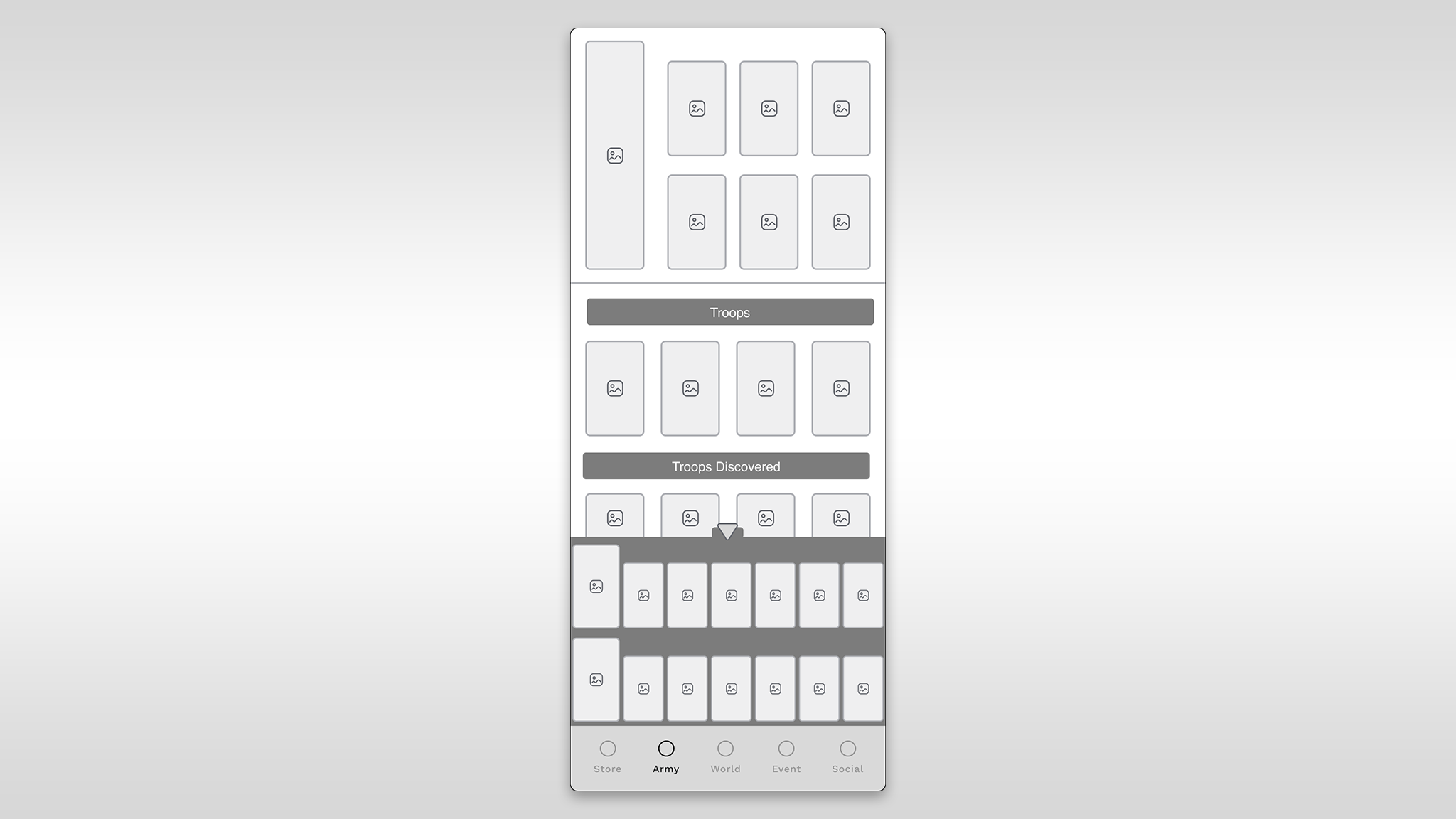
Fig: Option 3
Consistency: Maintains consistency with the current design, facilitating a smoother transition for existing players.
Thumb Accessibility: Placing Leaders at the bottom enhances one-handed usability on mobile devices, improving the overall user experience.
Familiarity: Users accustomed to the current layout may find this option more intuitive and less disruptive.
Limited Visibility: The bottom placement may reduce the visibility of Leaders, potentially causing users to miss important information.
Hierarchy Clarity: The bottom position may not effectively communicate the hierarchical relationship between Leaders and Troops.
Potential Clutter: Without careful design, placing Leaders at the bottom might contribute to visual clutter, especially with numerous Leaders.
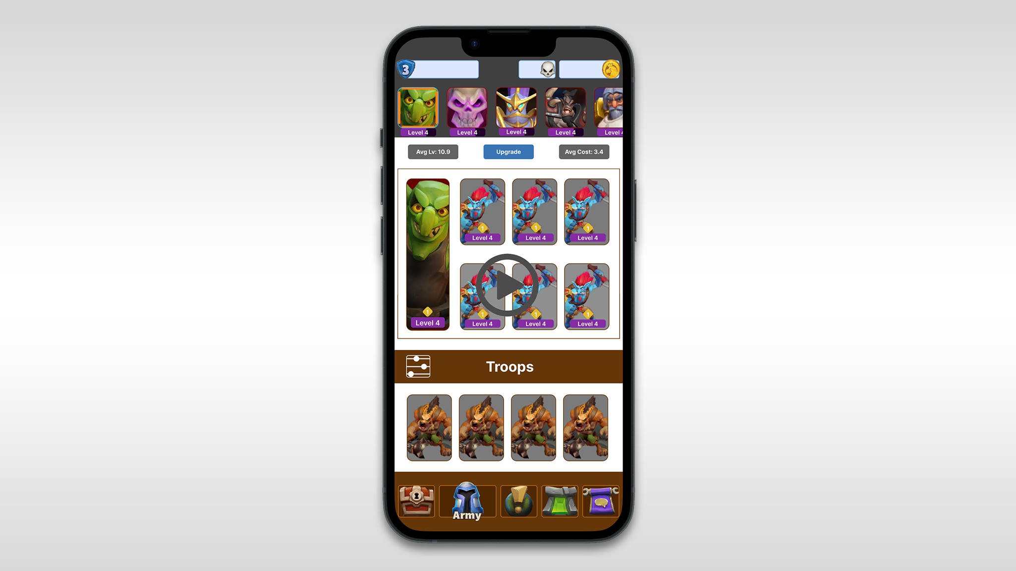
Fig: Selected Prototype
New Leader Select Flow: Unlocked Leaders are prominently displayed at the top of the Army Screen.Horizontal scrolling facilitates easy access and expands as more Leaders are unlocked.The widget is frozen at the top of the screen, ensuring constant visibility.
Streamlined Navigation: Remove the Leader sub-navigation button next to the Troops button for a cleaner interface.
Cosmetic Sections Integration: Introduce new sections for Tower skins, miners, and emotes in the Army Screen.Sections appear only when the player unlocks cosmetics, enhancing the interface as new items are discovered.
Leader-Cosmetic Association: Cosmetics are tied to each Leader, allowing distinct customization for each Leader's army.The revised flow for equipping leaders ensures accessibility, constant visibility, and maximizes screen real estate for cosmetics.
Fixed Widget Functionality: The fixed widget housing unlocked Leaders and discovered Leader icons remains visible at the top of the Army Screen, facilitating quick leader swapping and easy access to equipped cosmetics.
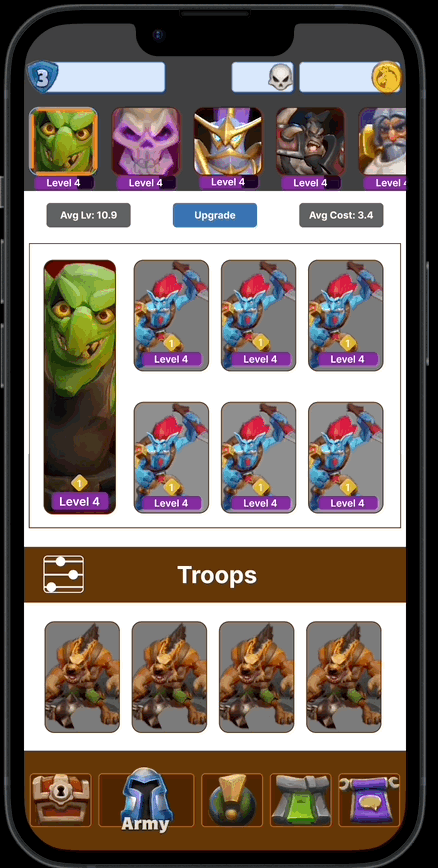
Fig: Fixed Widget
Equipping a Leader
•Single tap on any unlocked Leader icon will instantly equip that Leader.Equipped state is activated on the border of the equipped Leader.
• When a new leader is equipped, instantly update the lunchbox, and all cosmetics that are equipped to that leader.

Fig: Equipping a Leader


Interacting with Leader buttons.
Depending on the state of the Leader you are interacting with, different functionality will occur.
Equipped
Tapping an equipped Leader will automatically scroll to the top of the army screen.
Unequipped
•Tapping an unequipped Leader will automatically equip that Leader.
• The screen position does not change when switching leaders.
Discovered
•Tapping a Discovered Leader will automatically open the leader info screen.
•Upon closing it, retain the current position in the army screen. (Do not refresh and auto scroll to the top).
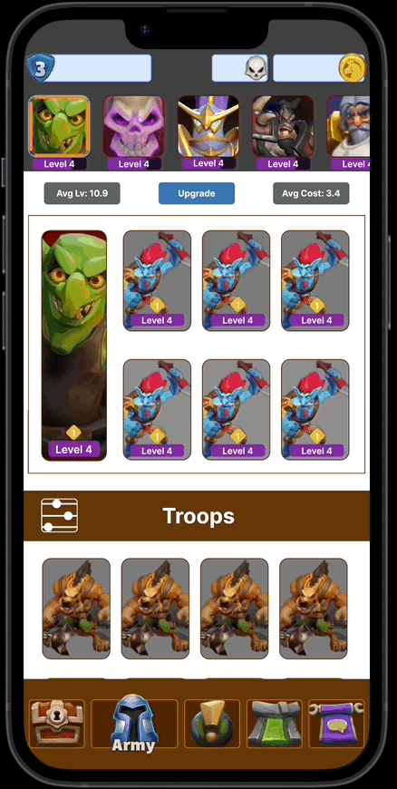
Fig: Accessing Leader Info
Accessing Leader Info:
• To access Leader Info you must first equip a Leader by tapping on their icon in the leader select widget. Once equipped tap the Leader portrait within the lunch box at the top of the Army screen.
• The Info/Equip buttons for leaders have been removed to reduce the number of taps to equip.
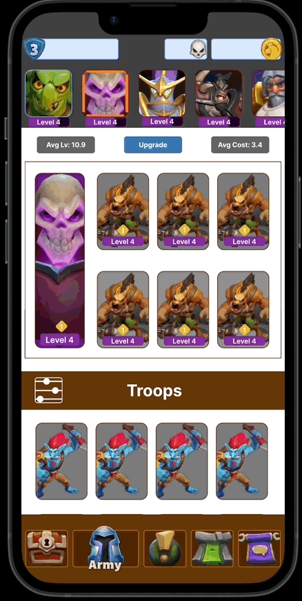
Fig: Auto Scroll
Auto Scroll Functionality:
• If you tap on the icon of the already equipped leader, the screen will automatically scroll to the top of the Army screen focusing on the lunch box.
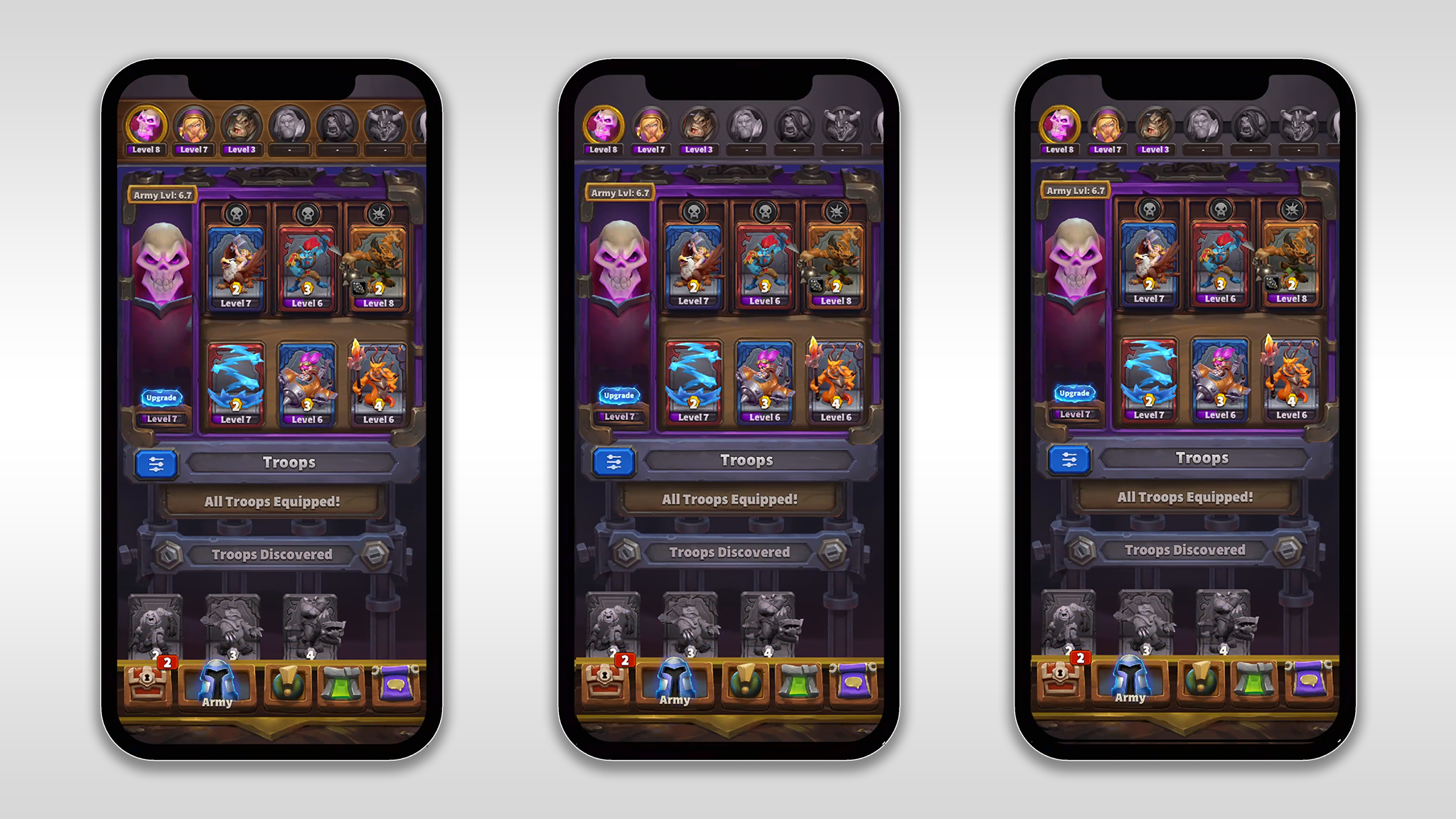
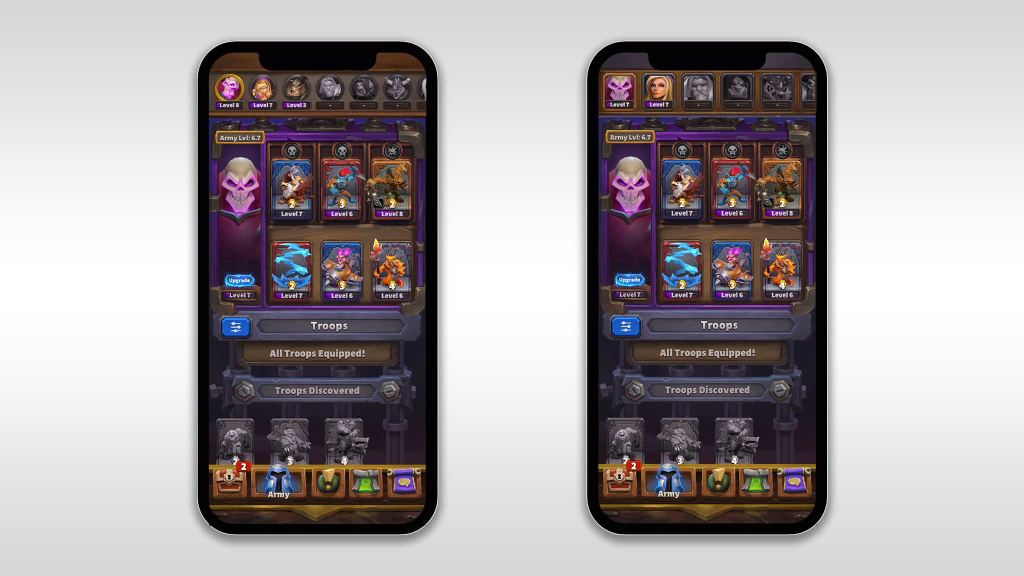
Fig: Art Exploration
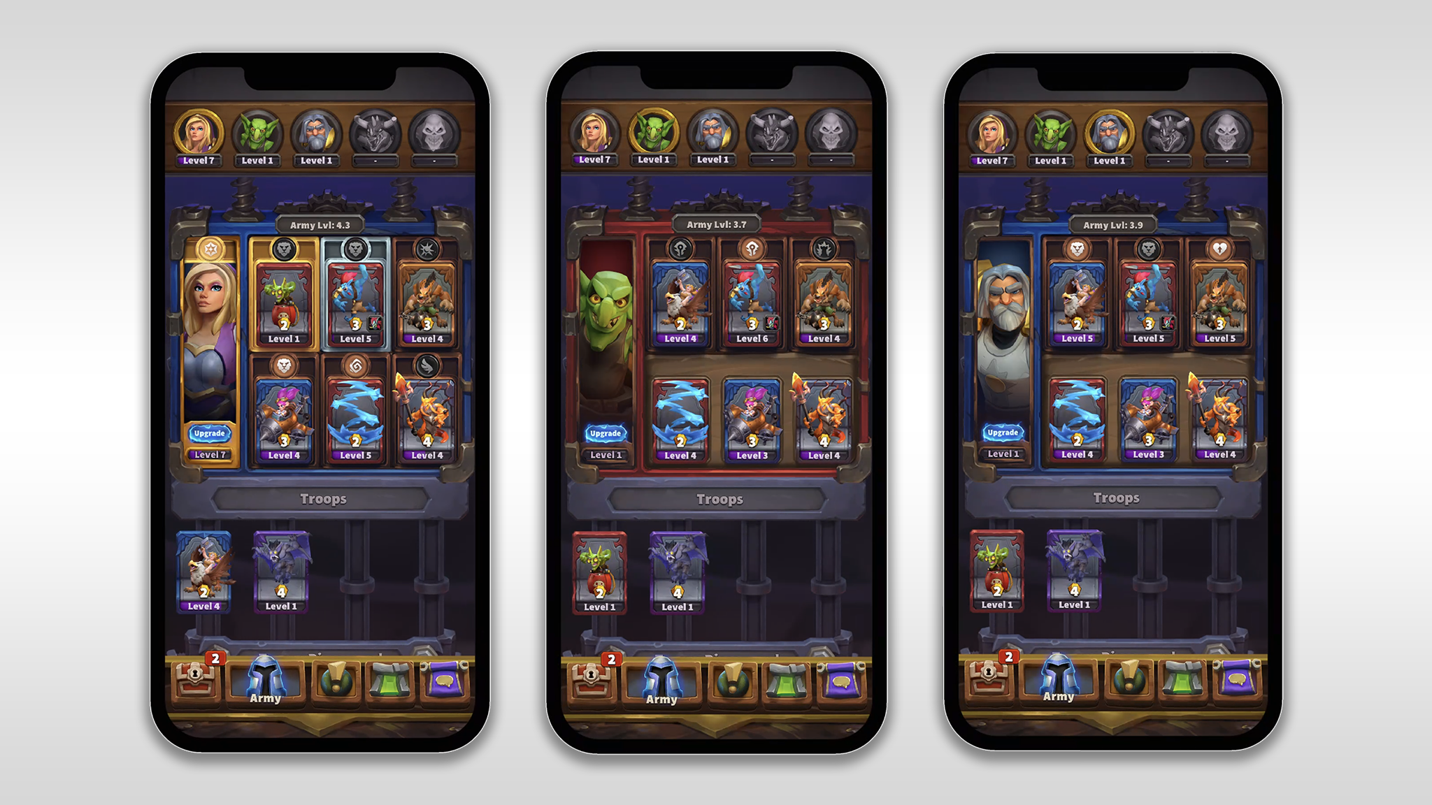
Fig: Final UI Views
This initiative was dedicated to elevating the user experience associated with Army Leader selection in the mobile action strategy game. Aiming to enhance player engagement, the project led a comprehensive UX redesign, resulting in a notable 40% increase in player retention on the feature through the simplification of the user flow. In addition, thorough research, prototyping, and testing were conducted, culminating in the development of a robust solution to address identified issues and significantly improve the overall usability of the Army Leader selection feature. Furthermore, the project team undertook art exploration and optimized interface layouts for 100% scalability across both iOS and Android devices, ensuring a seamless and responsive experience for all players.
Enhanced Visibility and Hierarchy: The chosen solution, Option 1, with the Leaders widget positioned at the top of the Troops, successfully established a clear visual hierarchy. Unlocked Leaders are prominently displayed, ensuring players can quickly identify and access their available options.
Streamlined Navigation: The removal of the Leader sub-navigation button contributed to a cleaner interface, reducing the number of steps required for players to manage their armies.
Cosmetic Integration: Future-proofing the game for the addition of cosmetics was achieved by incorporating new sections for Tower skins, miners, and emotes directly within the Army Screen. This seamless integration allows players to customize their armies without introducing unnecessary complexity.
Equipping Process: The revised flow for equipping leaders, including single-tap functionality and instant updates to lunchboxes and equipped cosmetics, streamlined the process and improved overall efficiency.
User Satisfaction: A significant increase in user satisfaction was observed during testing, with players expressing appreciation for the improved visibility and streamlined navigation.
Task Completion Time: The new Leader selection flow led to a reduction in task completion time as players could easily locate, select, and equip Leaders without navigating through multiple screens.
Learnability: The chosen solution adhered to common design conventions, contributing to a faster learning curve for both new and existing players. The intuitive association between Leaders and Troops positively impacted user understanding of the 1:𝑛 relationship.
Positive Feedback on Cosmetic Integration: Users responded positively to the integrated cosmetic sections, finding it intuitive and seamlessly integrated into the existing Army Screen.